It is often a problem for beginners who take photographs, draw pictures or render computer-generated images that the end result tends to look a bit dull, boring and lifeless, yet they can't put the finger on the problem and figure out the reason for this, no matter how much work they put onto creating the image in question (eg. in terms of texturing and lighting).
A very common reason for this is bad image composition. This short tutorial is intended to serve as a simple introduction to what makes a great image great, in terms of composition. It's not a definitive guide, but just a starter for further study.
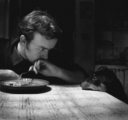
Let's go straight to the meat and start off by examining this absolutely superb photograph.
What makes this image so superb? The three main things are: The "rule of thirds", the diagonal rule, and the order of elements.
One common beginner mistake is to put the main subject of the image right in the center. While this makes the viewer focus on the subject being imaged, it makes the overall image less dynamic and more boring.
A common rule of thumb is to divide the image into thirds, both horizontally and vertically, and put the main focus either on one of the intersections, or alternatively (and depending on what is being imaged) on one of the dividing lines.
That alone can make the image already have a lot more dynamic feeling. Often there will be a secondary element in the image. If it can be placed on the opposite intersection, or the opposing dividing line. If there's a tertiary element in the image, it could be, if possible, placed on one of the remaining intersections. However, it's usually a good idea to leave at least one of the intersections "empty" as to not to overcrowd the image.
Note that the division into thirds doesn't necessarily have to be absolutely exact, and the subjects don't have to be exactly on the intersections or dividing lines. An approximate division and placement is ok too.
We can see this division quite clearly in the photograph:
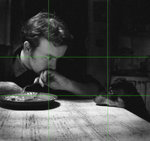
Notice how the eyes (the most important part of a face) are on opposing intersections (one of them having also the corner of the table), and the table occupying the lower third of the picture. The tertiary element (the plate) is also at the lower dividing line, touching one of the intersections.
Notice how there's nothing really important at the center of the image, or anywhere on the central vertical axis. Also the upper right intersection (and that entire quadrant) is virtually empty of content.
Another common beginner mistake is to composite the image in such way that the main features are arranged horizontally or vertically. This tends to make images look static and uninteresting.
The common rule of thumb is that the overall composition of the image should be diagonal. Either the main elements of the image are positioned diagonally (usually by putting them on the opposite intersections of the division lines), or otherwise oriented diagonally instead of horizontally or vertically.
A hasty idea to implement this would be to tilt the camera. While this can work sometimes, it's usually more disconcerting than useful. And often unnecessary.
In this particular example, we are photographing something happening on a table. Tables are naturally horizontal. How do we compose this image in a diagonal fashion? The photograph is, once again, a superb example of this:
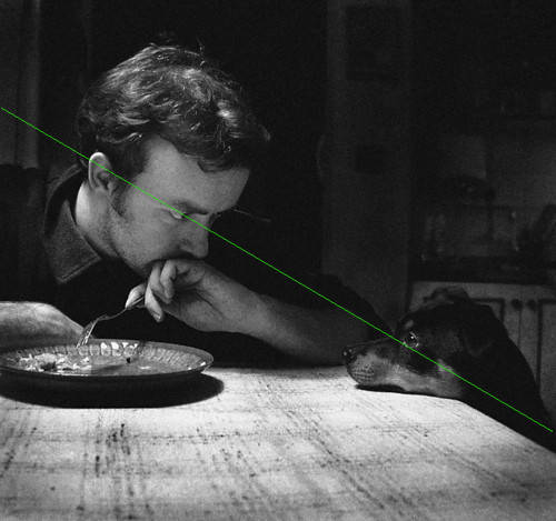
As you can see, the diagonal passes through the two most prominent elements of the image (the eyes) and roughly divides the image into a lighter part and a darker part. (As a bonus, the diagonal also roughly passes through the intersection points of the division lines, although this is not always an absolute requirement.)
Note that putting elements on both diagonals can sometimes work, but often makes things cluttered and confusing. If this is done, there should nevertheless be a "main" diagonal, with most of the focus, the other being clearly "secondary".
An advanced technique (which may not be applicable in all cases) is to not only put the main elements of the image at certain places, but give them a "focus priority". To make the image "tell a story" by drawing the focus in turn to certain elements.
Again, the photograph is an excellent example:
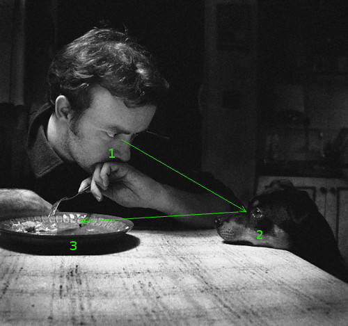
In western cultures, when there are many equally-weighted elements in a picture, the instinct is to look on the upper left corner first.
Another instinct is to follow the eyesight of a character to see what it's looking at, which in this case would be the dog. Again, here the instinct is to follow the dog's eyesight to the plate, giving a natural focus order to the elements of the picture, which tells a "story".
Not only are the elements positioned in a dynamic manner, but the image also draws the viewer's focus from one element to another in a natural order, "revealing" its contents that way.
Consider this photograph:
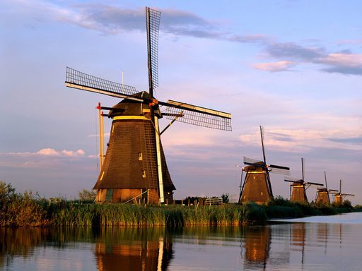
By now you can probably immediately see the rule of thirds and diagonals in action, but here they are explicitly drawn:
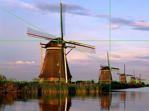
Note, once again, that the division into thirds doesn't have to be exact. Although in this case the photograph might even work better if part of the left side was cropped, making the division into thirds more accurate. (Try doing that eg. with a piece of paper and see if the image composition improves.)
There's also a minor order of focus in the image as well, as the focus tends to flow from the closest windmill (again at the upper left) towards the farthest one.
As mentioned earlier, a common beginner mistake is to divide the image in halves rather than thirds, putting the main focus of the image on the dead center of the image, or on the central axes. This is especially common with landscapes.
For example, consider these two landscape images:
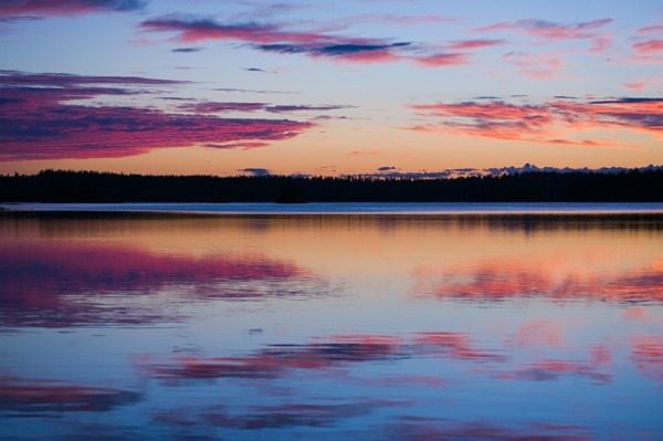
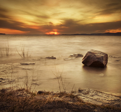
When the image is divided exactly in half, like in the first case, the focus tends to be lost. The "weight" of the image is too evenly divided into the two halves, especially in this case where the halves are almost exact mirror images of each other. The image may be pretty, but it's quite static and lifeless.
Putting the horizon on a division line by the rule of thirds, on the other hand, helps aiming the focus of the viewer. In the second image the water and its details (most prominently the rock) get a larger role, while the sky has only a "supporting role".
Consider these two movie posters:


One of them is much more static and the other much more dynamic. One of them plays with diagonal composition a lot more than the other. One of them can also be more clearly divided into halves than the other.